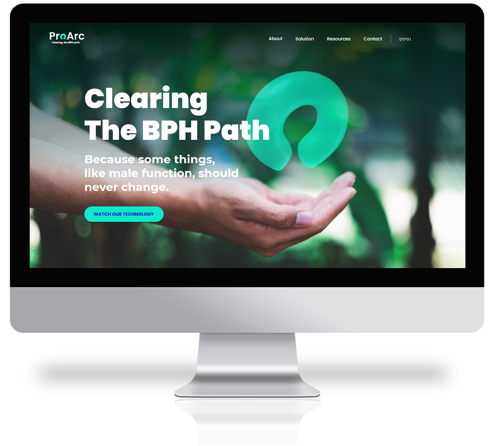
ProArc is a company dedicated to developing innovative and clinically effective devices that address unmet needs in the field of urology. Their Omega solution is a minimally invasive procedure that offers patients long term efficacy at a reduced risk. ProArc reached out to KRAFT. with a request to design a modern, sleek brand that would represent the innovative medical company.
The Challenge
ProArc needed a new brand identity that would reflect the company’s values and help them stand out in their industry. As a business in the medical field, we knew that the visual language needed to be sleek and portray reliability. After artistic exploration and analysis, we came up with a modern brand language that hit the nail on the head.
The outcome
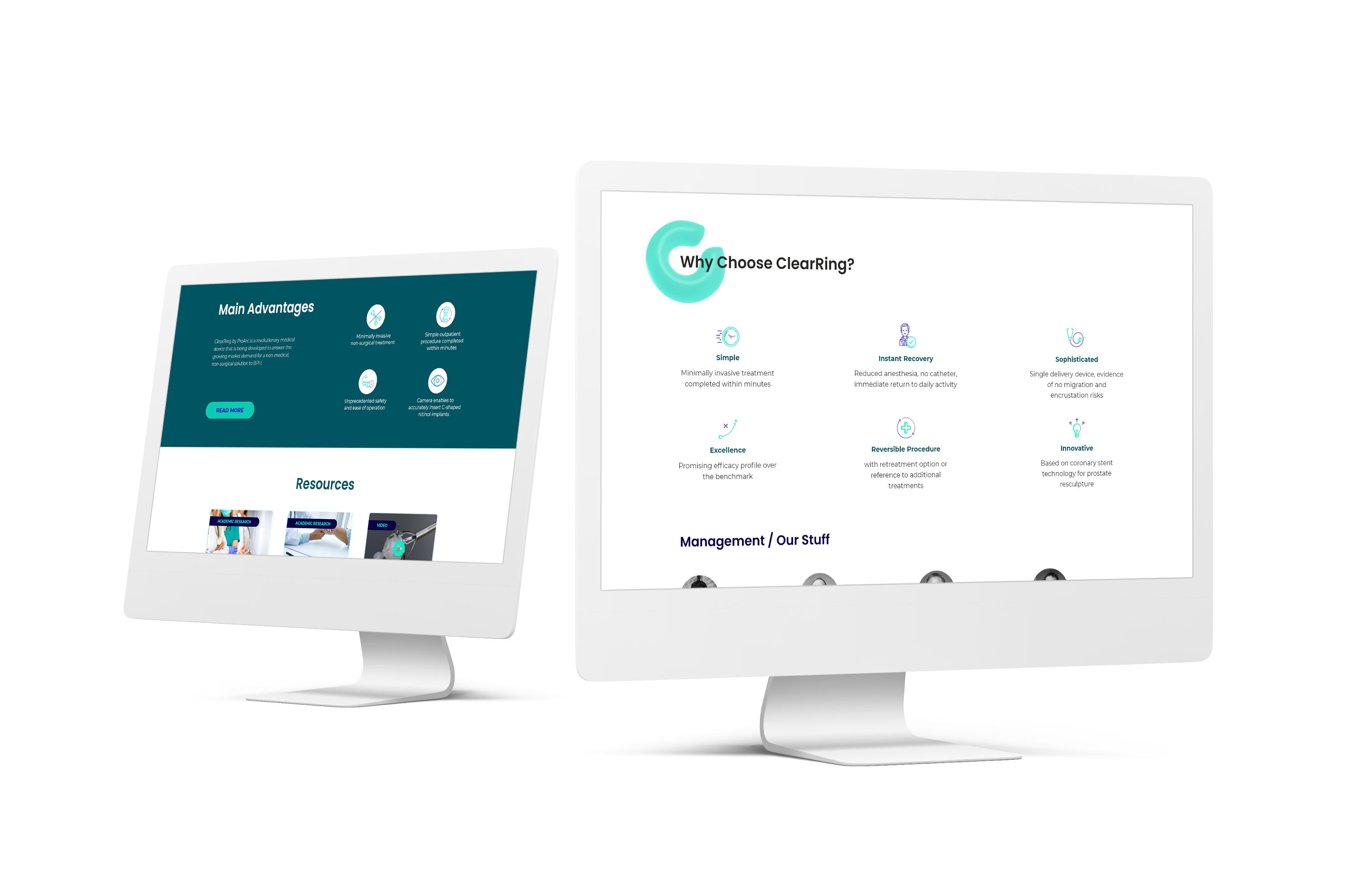
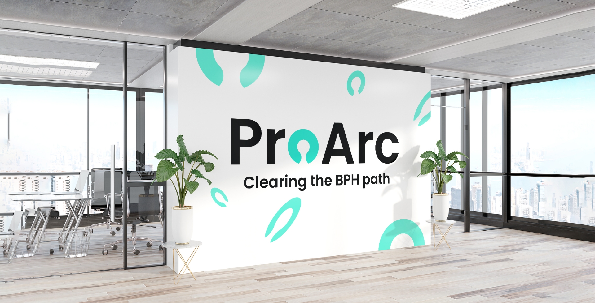
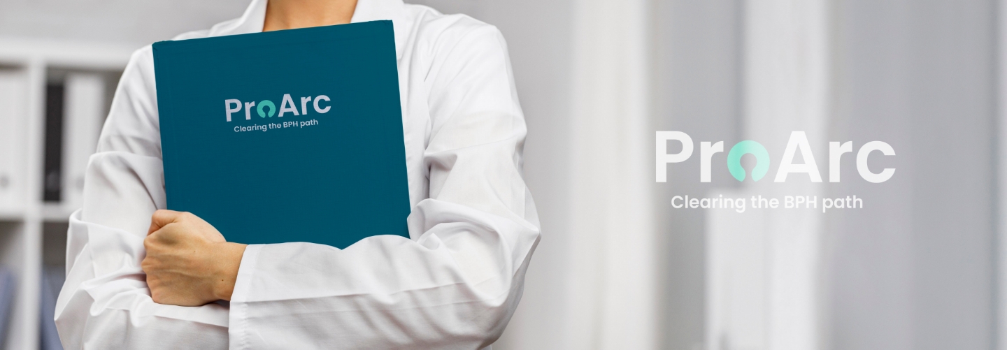
The result? A sleek brand that uses cool blue and green tones to display reliability and professionalism along with a new logo that incorporates the shape of the company’s medical device as the ‘O.’ We put the new visual language on display across a brand new website and a wide variety of marketing and sales assets.
Services
New UX/UI design and development for website
Key visuals
New visual language
Fresh logo design
Marketing and sales tools and assets
Presentations
Collateral
What’s a new brand without the materials to bring it to life? After creating the fresh look of ProArc, we got to work translating the modern visual language across sales enablement materials, email campaigns, social media templates, company swag, and more, not to mention a brand new website with the highest grade of UI/UX decked out with call-to-actions.